
December 31, 2011
In
News
Bloody Lovely!
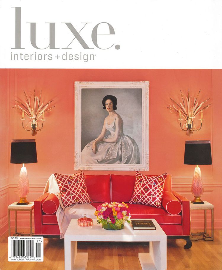
This is a very catching vignette! Why am I calling it “Bloody Lovely”? It feels English to me, but not Grandma’s English, but instead a more youthful English. I love the symmetry. I love the dissonance between the coral, pink, and red colors. I love the way the warm gold, whispy wall candelabras contrast with the cool boldness of the painting. I love the juxtaposition of traditional, contemporary, retro, and Asian styling. I love how the color black is strategically positioned to carry your eye around, and ground, the room starting with the woman’s hair, to the lampshades, to the arced feet of the sofa. So completely pleasing to my eye!!
~~ Susan ~~
MS Design Maven Marilyn Storey
January 13, 2012 at 12:02 amI BLOODY love this! The palette of pinks to salmons and reds AND the strategic use of the black and the white are artful. It seems old and new at the same time. Thanks for sharing this, Susan!
Susan E. Brown
January 13, 2012 at 8:44 amYou are so welcome, Maryilyn! My thoughts exactly!
Susan E. Brown
January 13, 2012 at 8:54 amOoops! I mean "Marilyn"!
MyWallArt.com
January 22, 2012 at 8:17 amHi Susan, nice blog ! I hope you liked the article about eco friendly 3d-wallpanels I sent you earlier. Thanks for it.
Meridith
May 10, 2014 at 12:31 pmWhat’s up, all is going fine here and ofcourse every one is
sharing information, that’s truly excellent,
keep up writing.