
Unveiling a vibrant home for art lovers + exclusive updates!
Happy June and welcome to another quarterly newsletter!
I’m very excited to share all the things happening at the studio – new projects, artwork, and exclusive insights into interior design trends! Let’s dive right in.
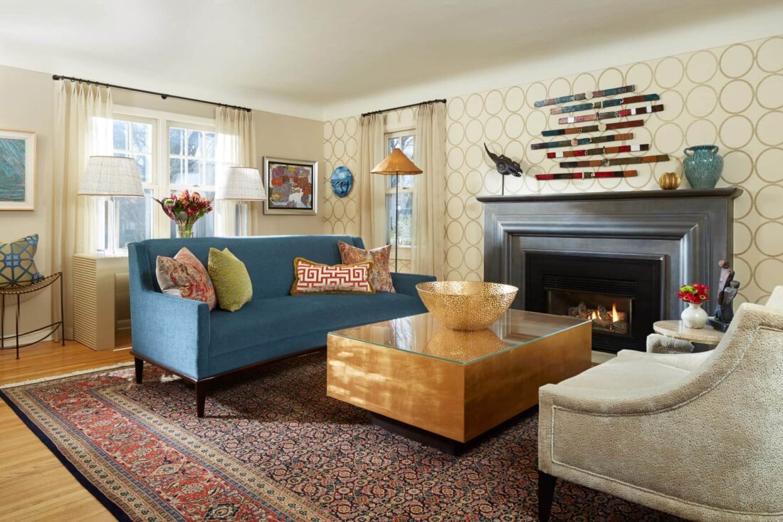
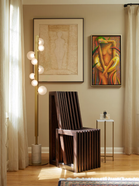
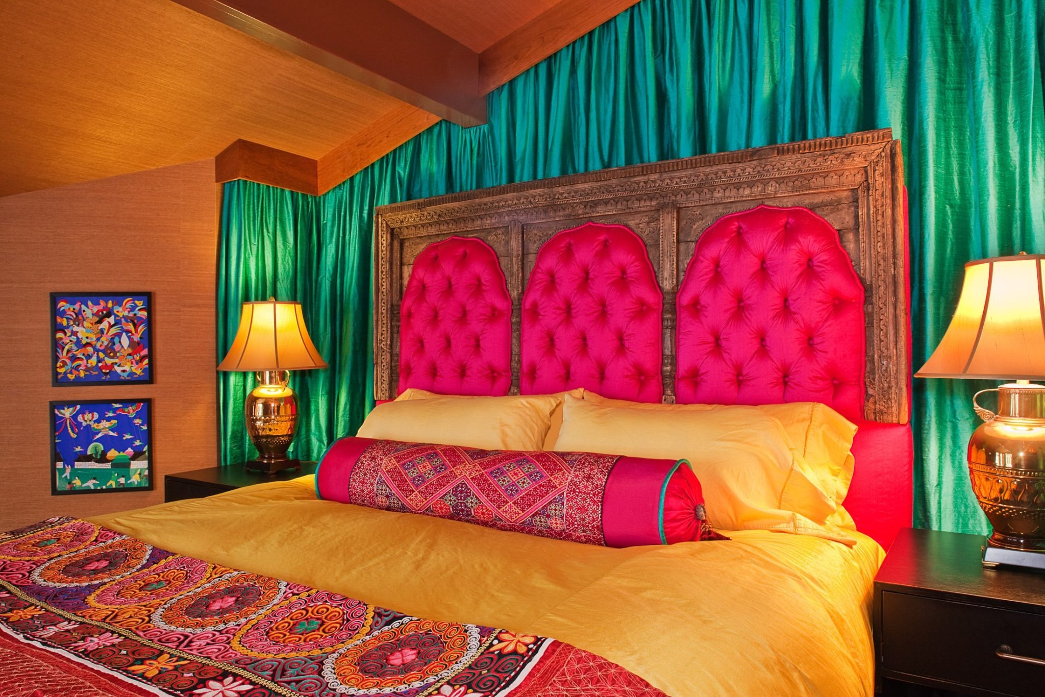
NEW PROJECT REVEAL (PICTURED ABOVE)
King’s Highway
This was a new client for us who found us online. They had lived in their home for many years and it needed an update on the main floor to include the foyer, living room, family room, and kitchen.
Their initial goal was to update the furniture and spaces, art placement, as well as create a space to be sellable in the future. However, after meeting with them and going through their art, we came to the conclusion something more mainstream for sellable purposes would not be “livable” for their vibrant personalities and wonderful art collection.We decided to create a home for their true nature (music to my ears!) and guess what, they love it!
Even R.T. Rybak, the former mayor of Minneapolis, after seeing the most colorful and patterned room of them all, stated he could easily live in the space and be very happy! I like hearing that!
Click here to see more of this project!
Photographers:
Karen Melvin (visit website)
Homecoming Photography (visit website)
MADE WITH HEART
Eddara Handmade Paper
In my free time, I create handmade paper art, a passion I discovered during grad school at the University of Minnesota.
Initially seeking a medium to showcase my thesis, “Integrative Interruptions in Color Relationships,” I explored various techniques before finding my calling in paper making.
Inspired by weaving classes with Charlene Burningham and paper making with Rebecca Alm, I developed a love for texture and versatility in paper pulp. My artwork, showcased at the University of Minnesota’s Vice President’s office, beautifully embodies my thesis.
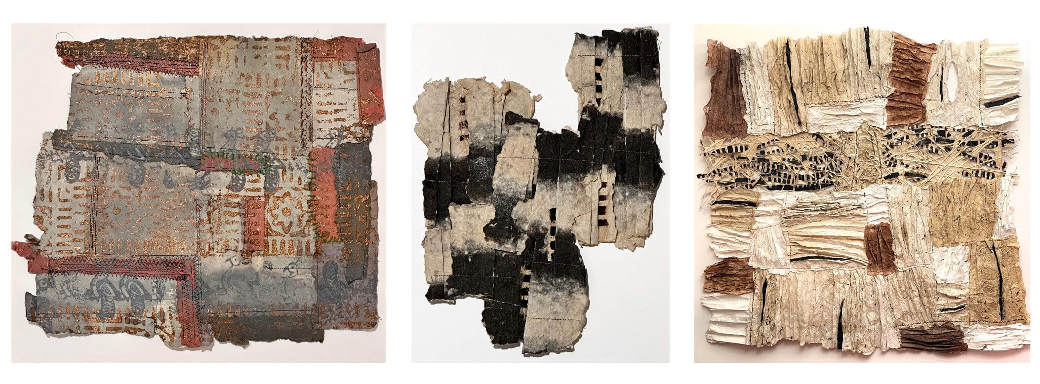
Explore my work on my website’s Eddara Paper page or visit my Instagram, @eddarahandmadepaper.
DESIGN DECODED
Color Blocking
I love the concept of color blocking and use it quite often in my design environments. What is color blocking you ask? According to the Dictionary (Oxford Languages)…
“In fashion and design, the use of contrasting blocks or panels of solid, typically bright color. For example, “coral leather looked infinitely cool styled with a cobalt skirt—a modern lesson in colorblocking.”
It’s often thought of as using colors that are opposite on the color wheel.
In interiors, I see color blocking as using large chunks of color on furniture and walls. I love how it strongly grounds a room creating a foundation for pattern in smaller proportions.
I believe it works whether you’re staying on one side of the color wheel using royal blue, purple, and teal or complementary colors such as blue, orange, and green.
Below are some wonderful ideas of Color Blocking. Check it out, and play around in your own home with the concept!
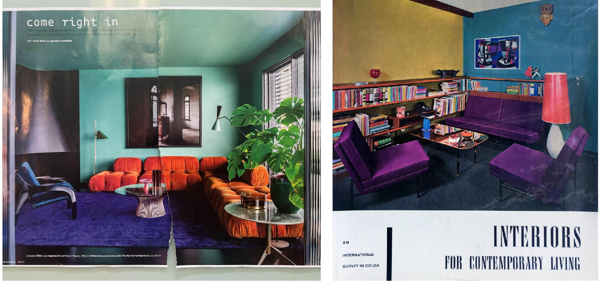
(left) The first from my most recent Interior Design magazine, Design by Giuliano Andrea dell’Uva Architetti, Photographer Nathalie Krag.
(right) A wonderful example from an old 1960s decorating book.
AND an example of my own work!!
Enjoy!
No Comments