Before and After: Kitchen Backsplash
Sometimes all you need is a small change to make a space feel updated and more “you“. Sure, a total remodel would be lovely, but not always feasible. If that’s the case, it’s important to figure priorities: “What is it about the space you truly can not live with, and with that in mind, how can we successfully integrate “you” with the existing furnishings?”
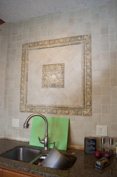
In this kitchen, the homeowner would have loved to have a whole new kitchen, but there were many things on the “to do” list, and because one of the homeowners creates chef-prepared meals and dinner parties for clients, she needed a kitchen she could enjoy. Her pet peeve: the backsplash!
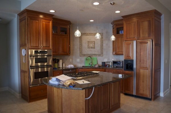
Her aesthetic is very contemporary and the existing kitchen is more rustic Italian…talk about contrasts, huh?
BEFORE:
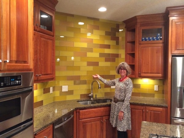
AFTER:
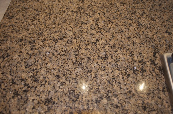
I used the warm cinnamon tones of the cabinets and the granite as our transition element, so the backsplash would not alienate the existing finishings. We used larger glass tiles to add some sheen (more contemporary) and positioned the tiles in a brick laying (half step) pattern to create movement. In the adjacent dining and living areas, there are a lot of royal blues, golds, and oranges, so the backsplash wall works as a beautiful complement.
My client doing her best “Vanna White” impression — pretty good huh? And the new backsplash…lovely! Check out her website Angel in the Kitchen for some mouthwatering, healthy enticements!!
Later!! Susan


No Comments