
Kitchen Design revisited – Still loved
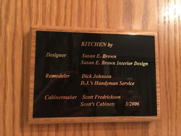
I recently went to a past client’s home to assist them in redesigning their Master Bath. I had helped them with the redesign of their kitchen about 10-11 years ago. My client’s could not stop telling me how much they still love their kitchen, and how it truly still works for all their needs. They even had a plaque made for the kitchen with my name on it!!! If that doesn’t warm a designer’s heart, nothing will! See below. At the time, the contractor was convinced the only thing to do was to keep the same floor plan, basically a very, very small U shape, typical for an older suburban home, and just update the finishings. I told him to wait and let me have a look.
 My client’s list of needs:
-Two microwaves next to each other as they get home late from work, and need to reheat previously prepared food
-Hidden out of the way place for the dog food with storage for a large food bag nearby
-TV to watch from kitchen table
-A lot more storage
-A small desk for the wife, who is quite petite and short
-A built in looking buffet for china, knick knacks, and collectibles. The wife collects a lot of fun teapots, and other items.
-A breadbox
-A lift for the heavy breadmaker and mixer
-Use hand painted fruit accent tiles purchased 10 years prior to remodel
-Cookbook storage
-Lower countertop for pastry baking
-A homey, charming feel
After looking at the space available, I was able to do it, AND get rid of the dreaded U-shaped peninsula that was not working for them.
BEFORE:
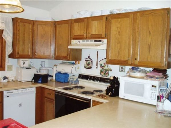
As you can see, it was crunched. The dishwasher and oven could not be accessed at the same time, plus the counters were full. Lighting was also a huge issue.
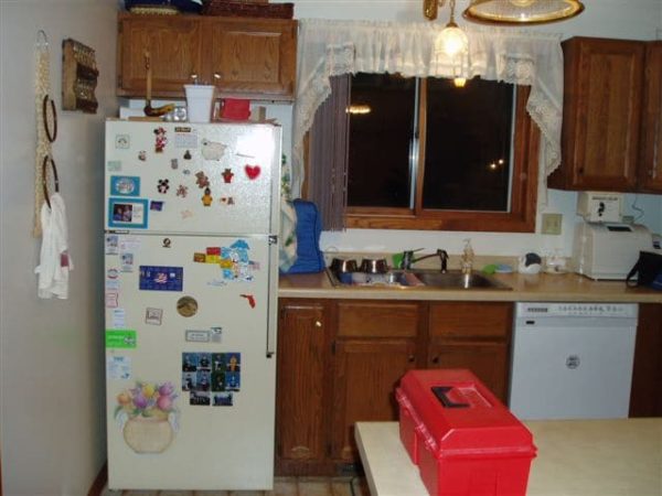
Here you can see the sink wasn’t even centered under the window!
AFTER:
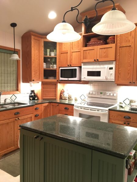
Here is the kitchen (well 10 years old new). The sink is now centered under the window. There are two microwaves for ease of warming up dinners. No more U shape! An island with beadboard holding cookbooks on one end. The island also holds the lifts for the mixer and breadmaker. There is multi height and depth cabinetry using the very tall ceilings in the space giving us a unique, custom look.
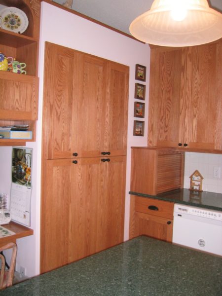 To the left of the sink, there was a back wall for the front door foyer closet. I used a small amount of that space and incorporated a very shallow storage cabinet, enough for 2 cans of soup, and quick access. This is one of their favorite pieces. The built in breadbox is on the end of the counter.
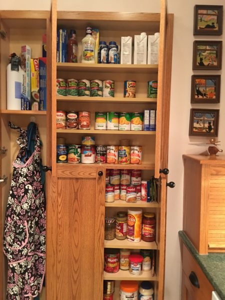
Inside the shallow storage.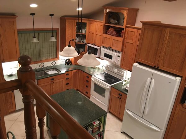
From the elevated living room, you can see different heights/depths of the kitchen giving it a unique flavor.
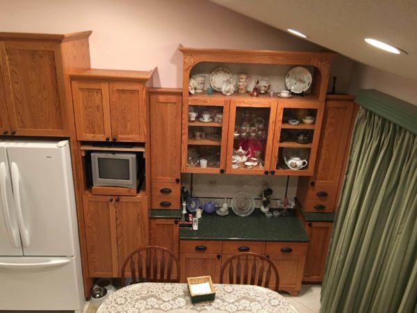
On the opposite end is the “built in” buffet so the wife could display her many cherished keepsakes. This countertop is lower for ease of pastry baking. To the left of that is the TV on a swivel, pull out platform. Under that is an open space for the dog bowls on the floor with a large cabinet above it for the dog food bags. The dog food bowls can easily slide under the cabinet when not in use.
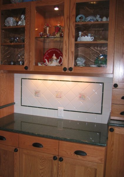
The handpainted pastel fruit tiles were incorporated in the buffet backsplash and near the stove and sink.
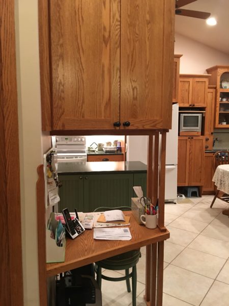
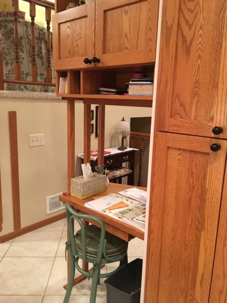
On the end of the foyer closet wall, I added a small desk area with storage above. We found a small antique chair, painted it, cut the legs shorter, and had a cushion made to match the custom window treatments.
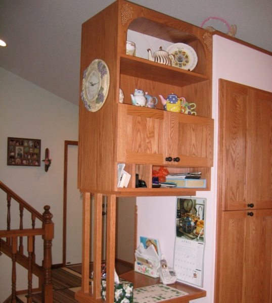 There is also storage for the teapot collection (which has grown)!!
When I visited recently for the master bath, the husband told me after the kitchen was completed, I had mentioned it was the first kitchen I had ever designed. He said he was surprised, and glad he didn’t know that at the beginning or he wouldn’t have hired me! I didn’t remember that at all! All turned out well…I mean, really, I have a plaque with my name on it!
Cheers, Susan


No Comments