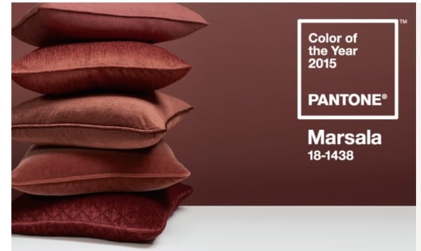
My Thoughts on 2015 Pantone Color of the Year: MARSALA
I LOVE IT!!! It’s earthy, warm, and inviting. It is winter after all. All right, that’s a wrap folks, see ya later!
Just kidding 🙂 I’m staying and I’ll elaborate. Do I ever not elaborate? 🙂 I’ve read many designers were surprised or don’t like it, but I totally saw it coming, and well, you already know how I feel. In fact, a few weeks ago, one of the main paint companies (Ben Moore, Sherwin Wm, Pittsburgh, etc. — can’t remember which one), sent out a survey to designers asking our input on their color of the year. Now that Pantone’s Color of the Year has become so popular, everyone is jumping on the bandwagon. What color did I pick??? A color very close to Marsala!!! Oh yeah, SCORE! High five!
Why did I select that, you ask? In my eyes, when changes are made in the home and fashion marketplace (not the Pantone yearly color, but more overall), I often see Contrast and Continuity taking place. Lately, there have been a lot of desaturated cool colors in the marketplace: grays, desaturated teals, etc. With the new color Marsala, we have contrast going from cools to warms, BUT we have continuity in staying with the desaturated tones. Can’t have too much surprise all at once!
So, in the last couple of days, I took photos whenever I saw a color that reminded me of Marsala. There was a lot! Of course, it’s like when you buy a new car and all of a sudden everyone has that car on the highway… Here ya go!
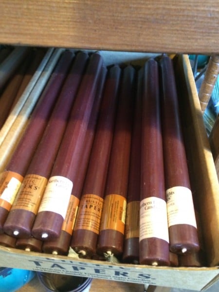
Candles at my local nursery/landscape store…
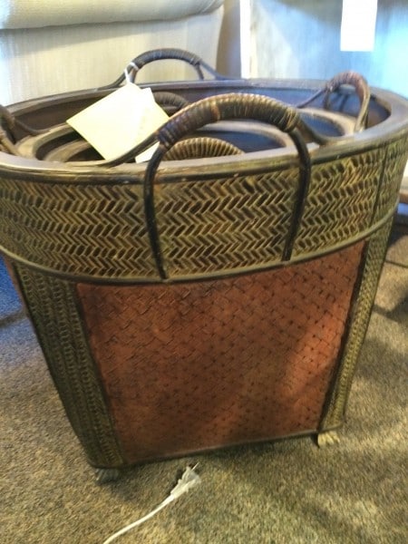
A basket grouping at a designer showroom…
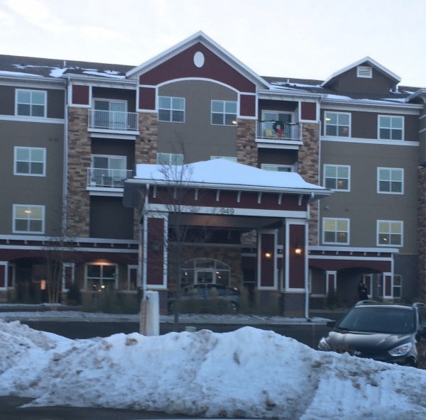
Accent color on a senior living high rise…
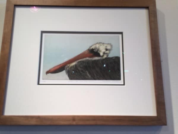
Beak color on this art by S. Martin at a local gallery…
I also decided to look back at some of my work to see if and how I’ve used colors similar to Marsala, since I am quite fond of it…
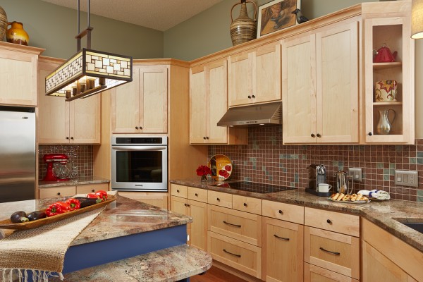
The main color of this glass backsplash in this recently completed kitchen with interruptions of desaturated and blue green glass tiles… Susan Gilmore Photography
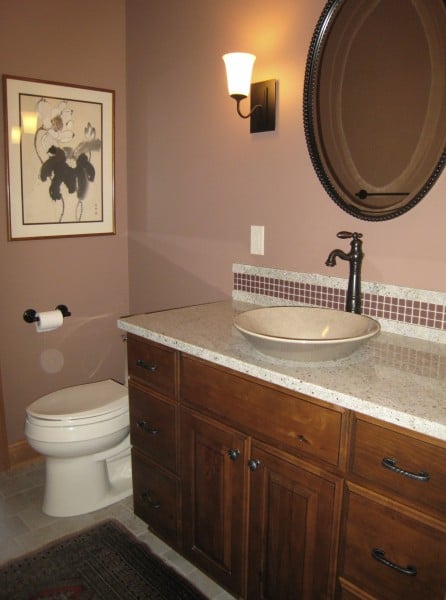
From a few years ago,a powder room with Marsala in the accent backsplash tiles and Persian rug…
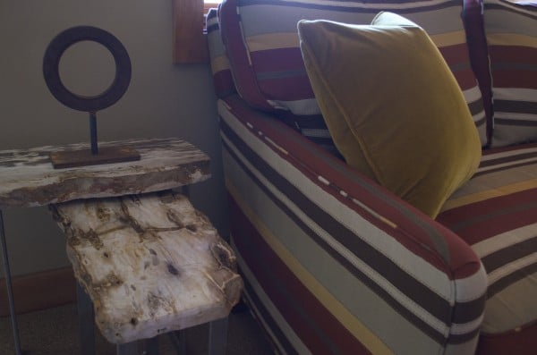 Part of this loveseat’s stripe color in a recently completed media room… Fabric by Donghia.
Sooo, I guess it is a color I love and use!! Maybe I’m biased? But I’m thrilled with Pantone’s choice, and I hope you find new ways to use this color in your home too!
Cheers!! Susan

Dee Schlotter
December 16, 2014 at 2:29 pmSusan, I love your blog and insights. I have to admit that I struggle with Pantone’s color of the year each year since the color is never with architectural/home design in mind first – it is fashion. Two years ago it was emerald green which we saw very little in home decor, last year it was radiant orchid and again, didn’t see it at all in soft goods. At PPG and the main architectural paint companies, like Ben Moore and SW, we research the textile markets to know what is coming in home decor products, fabrics, soft goods, so that the color of the year that we choose for paint actually has wall appeal as well as decor items to coordinate. Pantone – because of who they are -is fashion first and then maybe home decor. But in the past two years, I see very little of the Pantone’s color of the year in the mass home decor markets. Curious to see if this color is too soon, or not going to show up at all in home decor. Dee Schlotter
Susan E. Brown
December 31, 2014 at 11:28 amHi Dee! Thank you for your compliment! I love hearing your insights as well! I apologize for the late reply…I will have to check my notifications on why I am not alerted to comments. I agree with you whole heartedly! I do believe Pantone’s direction is not merely for the architectural/home industry but a much more broader version incorporating so many varying areas such as fashion, but also the graphics and commercial industries. This year the color is so much more earthy that I finally do see it being incorporated into the home much easier, but that could also be because I am situated in Minnesota where we tend to like warm, earthy colors due to our long cold winters. What is the color Pittsburgh selected this year? I do think it was your survey that I completed a few months ago. Let me know! I’d love to do a post on it! Again, thank you for your comments! Hope to hear more. Best, Susan